


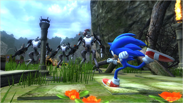
I'm sure that I don't need to remind everyone here about the immortal SEGA mascot, Sonic the Hedgehog, with his emphasis on speed based platforming and intensely beautiful graphics...I've noticed its inconsistent and varying art and play styles as the series made its jump to 3D. I've noticed fan complaints about there not being a full-fledged 3D Sonic game that fully committed to that claim, And an open world game, at that. The theory I have in mind is to explore those exact possibilities.
Now, you may be wondering, what does all this have to do with Jay Ward 1960s cartoons? Well, I'll tell you: one day, I hope to pitch to SEGA a 3D open world Sonic the Hedgehog title exclusively for the 3DS with a 1950s/60s cartoon art style/sensibility! Think of the graphical possibilities! To integrate a long since forgotten art style into a 21st century video game! Not to mention that it would certainly freshen up the Sonic franchise! Instead of those gritty, hyper-realistic visuals featured in past Sonic titles(Unleashed, Generations)it swapped out all those with some actual hand-painted and heavily stylized retro visuals recalling those of the Pink Panther, or Mr. Magoo, or the late 50s Looney Tunes cartoons? A green sky for once, with blue brush strokes for clouds? And bizarre, angular structures recalling those of the works of Maurice Noble? It would break the 'Nostalgia pandering' of Sonic Mania/Forces, as well as introduce a new visual style to the Sonic series.
Now, the reason why I propose this is that, even in the Genesis days, Sonic's level design was always primarily flat, but rather detailed and extremely colorful. The UPA cartoons had these groundbreaking flat visual designs in each of their cartoons. Lately, thanks to the technological advancements, especially in the art industry, a lot of modern projects are being produced with a backwards sensibility, Disney's Paperman as an example. I honestly do think that this would be the proper time for Sonic Team to develop a title using the artists' touch to their advantage. To fit the retro cartoon look, Sonic and the rest of the characters would be 'Toon-Shaded', or 'Cel-Shaded'; what I mean is that they would have thick outlines for the body, but the rest of the character's shading be only shades of color, rather than realistically lighting them. The gameplay would be recalling Sonic
Adventure's at its best, and maybe implement Lost World's parkour techniques; when I played Generations, I noticed how rather slippery Modern Sonic felt to control, he felt very lightweight compared to Super Mario, and I hope that the physics in this hypothetical game can rectify that qualm so you will have a rigid sense of control at rapidly high speeds. The zones' designs would be open world, yet still feel like flat, Golden Book-esque illustrations Sonic is running through, making sure to build themselves around Sonic's speed and platforming mechanics, providing a smooth experience. The games are practically built like racing kart video games anyway, but with platforms. With that in mind, a potentially decent Sonic game might actually be in the works.
 To provide an even bigger jolt to the Sonic franchise, the music would be composed by Two Man Gentlemen Band of Wander over Yonder fame, as I'm trying to go for a more fast-paced 1950s country rock score for this title. For the speed sneakers, they would contain the famous Sonic theme song, "Gotta Go Fast" for the Sonic X anime released in the early 2000s, but this time, played with a more traditional country flavor.
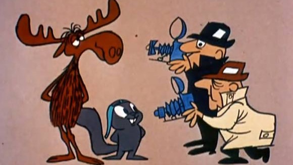
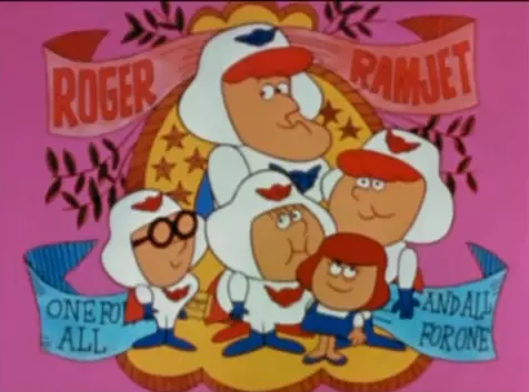
 The games' comic writing style has always ranged from annoyingly cheesy to chuckle-worthy, courtesy of Ken Pontac and Warren Graff of Happy Tree Friends fame. This is also why I wanted this title to go back to the 1960s: their type of comedy is so Rocky and Bullwinkle-remniscent, why not make a game that reinforces that style of self-referential humor? That's why I also want these 2D cutscenes in the style of Roger Ramjet/Rocky and Bullwinkle/Underdog to tell the story as well as entertain; they're a lot more cheaper to produce than CGI, and allow for more adventurous storytelling to happen within the game. Complete with a narrator and all! No one can complain about awkward/shoddy character movements because its a drawing!
But alas, I have not been gifted in the art of video game making, nor am I headed on that path. I barely know how to program, let alone make a video game. Unfortunately, you NEED to be a proficient game developer along the lines of Christian Whitehead or Dimps to even CONSIDER pitching SEGA an idea for a game. These ideas will unfortunately remain hypothetical, I'm afraid. It would be fun to DRAMATICALLY change a renowned childhood character, but my current circumstances will not allow such chances. That's why I'm glad I have this blog!


